
Using infographics for internal communication is not simply about creating an attractive design. It also requires making sure the message is suited to the format and that the data is not simplified to the point of losing accuracy.
Many organizations turn almost every announcement into a visual piece, expecting design alone to solve the attention problem. Sometimes it works. In other cases, the infographic simply transfers the same information overload into a different format.
That is why the real question is not whether organizations should use them, but when to use infographics in internal communication to improve understanding—and when the format may actually add more noise.
Why Not Every Internal Communication Message Needs an Infographic
An infographic cannot fix a message that is too long, unfocused, or lacks a central idea. Before designing anything, the content itself needs to be edited and the organization needs to define what the audience should understand or do.
When a written announcement fails to capture attention, many Internal Communication teams try turning it into a visual piece without first reconsidering the type and amount of information involved.
Two data points help illustrate the problem:
- According to Microsoft’s 2024 Work Trend Index, 85% of workplace emails are read in less than 15 seconds.
- A Nielsen Norman Group study on web reading behavior estimated that people can read at most 28% of the words on an average web page during a typical visit; in reality, the proportion is often closer to 20%.
The problem, then, is not simply the format.
It is also about how much information the audience needs to process and how clearly that information is organized.
As we explain in our article on effective internal messages, people need to quickly identify what is changing, why it matters, and what action they are expected to take.
Turning a long, disorganized announcement into an infographic does not solve workplace information overload.
It simply changes how that overload looks.
That is why, before redesigning content, it is worth asking whether the message can be reduced to one central idea. If it still requires too many explanations, caveats, or exceptions, it needs editing before it needs design.
4 Cases Where Infographics for Internal Communication Work Best
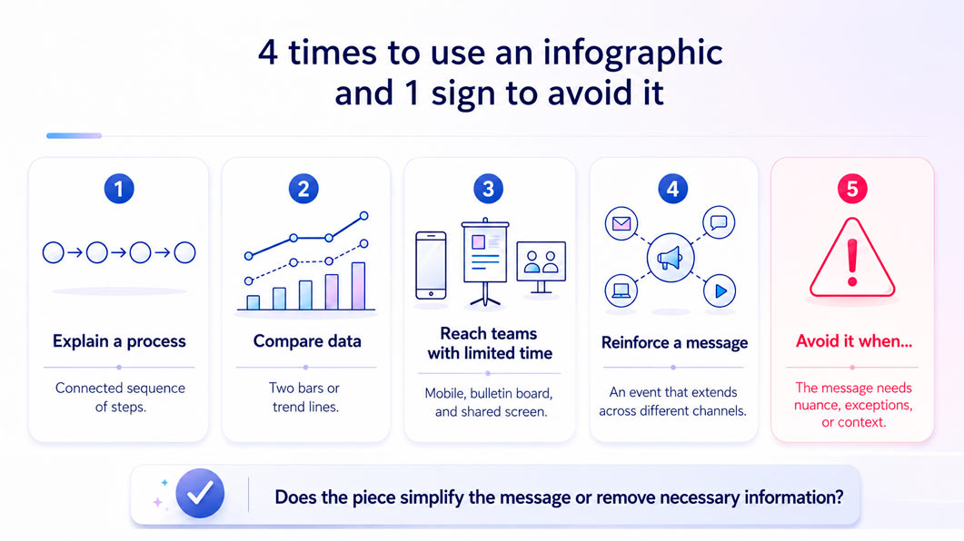
Infographics work particularly well when they help visualize a sequence, compare data, adapt information to the audience’s real context, or reinforce a message after an event.
1. Infographics for Explaining Internal Processes Step by Step
Some information is easier to understand as a visual sequence than as a long written explanation.
Dual coding theory suggests that information can be processed through related verbal and visual systems. Combining concise language with relevant visuals can therefore make a sequence easier to understand and remember.
In practice, this can be especially useful for:
- instructions for using an internal system or tool;
- approval workflows involving multiple steps or stakeholders;
- policies that replace a previous procedure;
- onboarding journeys with clearly defined stages.
When the goal is to remember a sequence of actions, a process infographic can be clearer than instructions developed across several paragraphs.
2. Infographics for Communicating Data: Comparing Figures and Showing Trends
An infographic is particularly useful when the audience needs to quickly identify differences, relationships, or changes over time.
A chart can communicate in seconds what might otherwise require several lines of explanation.
For example, it can compare results across different periods, visualize an internal survey, or show the progress of an initiative.
Scott Berinato explains in Visualizations That Really Work that the growing volume and speed of data make visual abstraction increasingly important for helping people understand information.
However, every visualization should answer a specific question.
An infographic does not replace analysis. It communicates the analysis once that work has already been done.
Visual data also needs clear scales and enough context to be interpreted accurately.
Otherwise, the result may look compelling while communicating the wrong conclusion.
This principle is equally important when moving from activity metrics to impact metrics.
3. Infographics for Teams with Limited Time or Screen Access
Not everyone in an organization receives information from a desk or has the same amount of time available to read.
As we explain in our article on segmentation and storytelling in internal communication, adapting the format to each audience can determine whether a message is understood or simply gets lost.
A visual format often works better than long-form text when communicating with:
- frontline, manufacturing, field, or operational teams;
- employees who check information on their phones between tasks;
- people who receive messages through bulletin boards or shared screens.
In these situations, an infographic creates value because it adapts to the real conditions in which employees receive information, rather than forcing the audience to adapt to the format.
4. Infographics for Reinforcing a Message After an Event
A Town Hall, launch, or major announcement can concentrate a large amount of information into a short period of time.
Its impact therefore depends partly on how those messages are sustained after the event.
As we explain in our article on how to improve Town Hall impact, follow-up content can extend the key ideas through employees’ everyday communication channels.
A wrap-up infographic featuring three or four key messages gives employees who could not attend—or who simply need to remember what was announced—access to the essentials without having to watch an entire recording.
In this way, visual content works as reinforcement rather than as a replacement for the full conversation.
When Not to Use an Infographic in Internal Communication
If a message requires nuance, exceptions, detailed context, or a sensitive explanation, an infographic is usually not the best primary format.
Visual simplification can become distortion when it removes information that people need in order to correctly interpret a policy, decision, or data point.
Research on graph-reading tasks found that task-irrelevant data increased processing time, error rates, and cognitive load. Adding more visual information does not automatically make something easier to understand.
Before starting the design process, look for these warning signs:
- cropped axes, unclear scales, or too many colors that distort the data instead of simplifying it;
- a topic with multiple exceptions or layers of information being forced into a single visual;
- a message that needs context rather than just a summarized idea.
Before converting content into an infographic, the key question should therefore be whether the message is simple and visual by nature or whether it needs to be explained with nuance.
How to Move from Decorative Infographics to Strategic Infographics
A strategic infographic begins with the objective and the audience. A decorative infographic begins with the need to “make the content more visual.”
Using this format effectively does not depend primarily on the design tool.
It starts with an earlier decision: understanding what the audience needs, what action is expected, and how much context the message requires.
Moving from decorative to strategic infographics does not mean designing more pieces.
It means making better decisions about when visual communication can organize a sequence, compare information, improve access, or reinforce an idea.

Infographics for Internal Communication
At Oxean, we help organizations design Internal Communication strategies and content that combine clarity, creativity, and the right channel strategy.
FAQ – Frequently Asked Questions
When should companies use infographics for internal communication?
Infographics work best when they help employees understand a sequence, compare data, access information quickly, or remember key messages. They are especially useful for internal processes, data and trends, teams with limited time or screen access, and follow-up communication after events or major announcements.
How can infographics help explain internal processes?
Infographics can turn a sequence of actions into a clear visual journey. They are particularly useful for explaining internal systems, approval workflows, new procedures, policies, or onboarding stages when employees need to understand and remember a specific order of steps.
Why are infographics useful for communicating internal data?
Visualizations can help employees quickly identify differences, relationships, and changes over time. Infographics can be effective for comparing results, presenting internal survey findings, or showing the progress of an initiative, as long as the data includes enough context and clear scales to be interpreted accurately.
Can infographics improve communication with frontline and operational employees?
Yes. Visual formats can be particularly effective for frontline, plant, field, and operational teams that may have limited time or access to desktop channels. A concise infographic can adapt information to mobile devices, bulletin boards, shared screens, and the real conditions in which employees receive messages.
When should an infographic not be used for internal communication?
An infographic is usually not the best primary format when a message requires nuance, multiple exceptions, detailed context, or a sensitive explanation. Simplifying this type of information too much can remove essential context and lead employees to misinterpret a policy, decision, or data point.
What makes an internal communication infographic strategic rather than decorative?
A strategic infographic starts with the communication objective and the audience, not with the desire to make content look more visual. Before designing it, organizations should define what employees need to understand, what action is expected, and whether a visual format is actually the clearest way to communicate the message.